
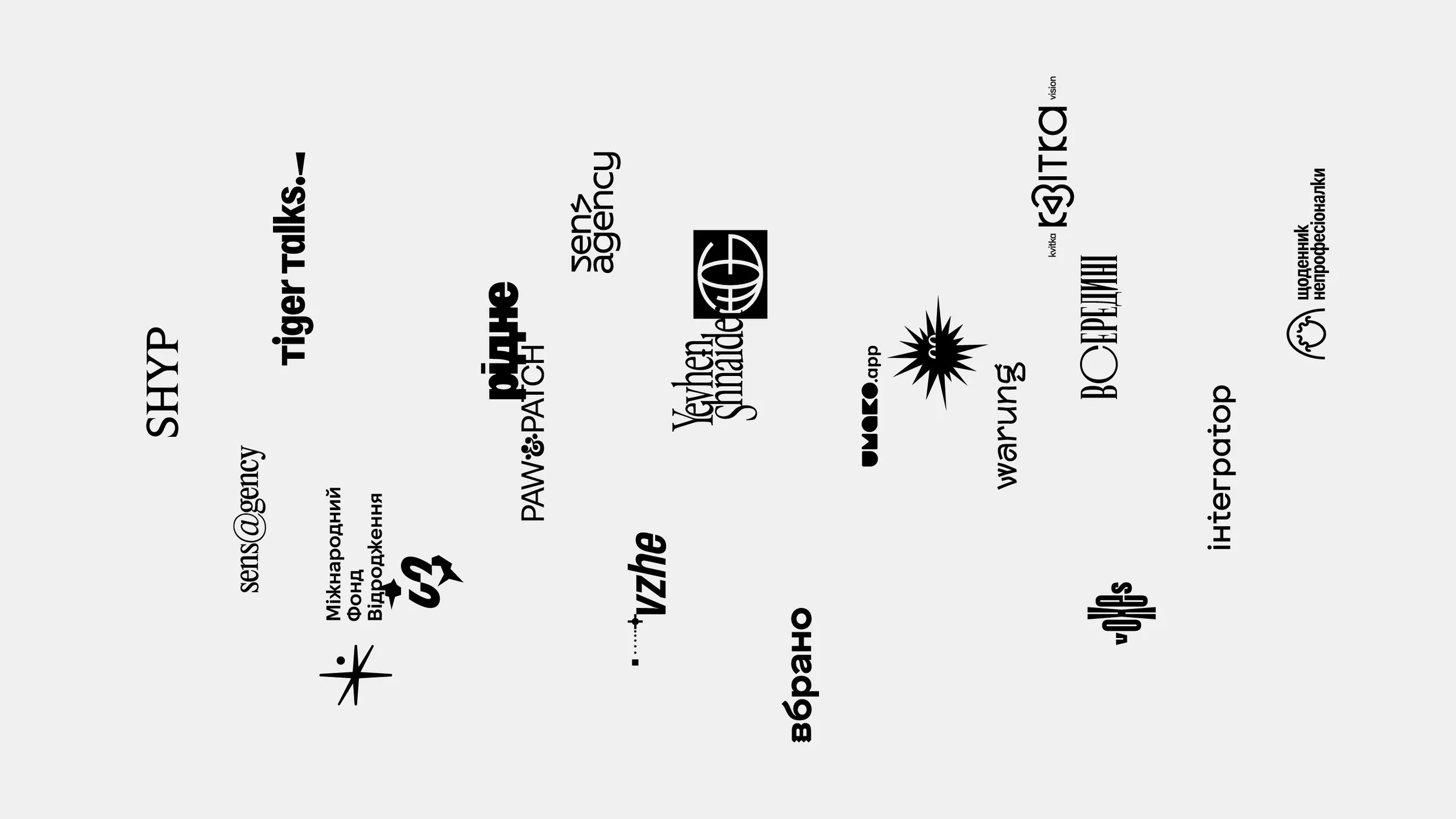
1k — 1logo
About
1k — 1logo was a charitable initiative: a logo in exchange for a 1,000 UAH donation to a fundraiser supporting Ukraine. It was never meant to replace the work of agencies or independent designers, but to offer an alternative to a DIY logo made in Canva. For a symbolic price, each participant received one finished logo, ready to launch a business, a project or an idea.


Ridne
An online collection of cool Ukrainian websites. The logo borrows from newspaper mastheads: bold letters bleed into one shape, like ink on thin paper. Only the dot over the «і» breaks away, marking the Ukrainian letter.


Integrator
CRM/ERP system implementation service. A simple wordmark where the dot of the «і» is built into the other letters, like the smallest unit in a database. The «t» with its dot works as a standalone sign, and the logo carries over to English almost unchanged.


mln
Marketing consulting personal brand. A practical logo built on massive lettering that reads like a foundation.


Olegivna
A family sourdough bakery in a village. Being a family business, the logo takes the form of a coat of arms. The shield is a slightly elongated oval that also recalls a loaf, and inside it sits a soft, flower-like shape, puffed up like rising dough.


Umako app
A Patreon-style platform for supporting content creators in crypto. A wordmark with unusual letters that look like a set of shapes at first glance. The five-letter name is built from just two shapes that alternate one after another.


GTO
A platform for searching and booking tours and flight tickets. The logo is based on a projection of the globe with the letters of the name built into it with the letters of the name built into it. Like the Earth, it's flattened at the poles, only more so.


Diary of a Non-Professional
A personal blog about travel and modeling. The logo is a stylized portrait of the blog's author. Just four lines are enough to make it look like her.


Tiger talks
A school of public speaking. The logo is built around an exclamation mark, a sign of emotion in text, turned 90 degrees into a simple figure of a person speaking: the dot is the head, the line is the voice. In the full logo it sits where punctuation would, like a new punctuation mark.


Warung
An Asian restaurant. A wordmark with letters that look like they're made of tree branches, echoing the wood in the restaurant's interior, from materials to prints. The style gives an Asian feel without relying on the usual stereotypes.


Iryna Zelena
A jeweler's personal brand. The sign is a monogram of the jeweler's initials, inspired by her experiments with both fluid and raw, sharp materials. Each letter combines the two: the soft shape is the same in both, while the sharp ones echo each other across the diagonal.


Crossover
A podcast about the film industry. The name sits in square brackets, used for comments in script drafts, just as a podcast is a place for discussion. Upright brackets and a slanted name mix two styles in one logo, like a crossover where characters from different worlds meet.


SHYP
A personal jewelry brand. SHYP is a transliteration of the Ukrainian word «шип», meaning thorn. The jewelry is known for its natural forms, so the serifs of the letters are shaped like the thorns of different plants, bringing together nature and the name itself.


Vzhe
A motion designer's personal brand. The logo borrows details from the After Effects interface, the main tool of motion designers. The name sits in a block like an animated object, and the line with two keyframes in front of it shows its motion path.


BDZM
BDZM (Combat Porcupines from Mykhailivska) is a volunteer center supporting various units of Ukraine's Defense Forces. The logo is based on a porcupine, shown not literally but through its prickliness: a spiky ball with slightly uneven quills that feel natural.


Voxes
A visual voicemail app. The logo takes a familiar idea, a sound wave, and draws it in an unexpected way, with the letters of the name. The short name keeps the wave concise and expressive.


Sens Agency
An agency developing personal brands on social media. The @ sign fits naturally into the name and turns the text into a logo with minimal effort.